
Last year, after delivering a Human-Centered Design (HCD) workshop for higher education practitioners, a participant stayed back to ask a question. To our surprise, the question was unrelated to the session topic.
“What does your company name mean?”
Her body language suggested she already had some assumptions, so we posed the question to her. After thoughtful consideration, she responded:
“Roots attach to the foundation, and they come from the values and what’s most important. For rivers, those flow out into the rest of the world and affect the ecosystem.”
Mentally, we’ve always understood how important it is for our brand to be clear to our audiences. In that moment, however, we experienced this principle on a visceral level.
The participant got it right for the most part. The meaning of Roots + Rivers Collective is nuanced and multi-layered, and the foundation aspect is key. We believe that it is critical to build solutions, policies, and communities on healthy, solid ground. Values play an integral role in that process as does ethical research and analysis. As we work to address complex problems in partnership with clients, we allow the research to lead us to the root issues so that they can be confronted, resolved, and replaced with systemic solutions.
As the participant intimated, rivers are a life-source that can benefit an entire ecosystem. Once solutions are anchored on a healthy foundation, there are specific resources–human capital, technical infrastructure, community cohesion–that enable them to thrive over a sustained period of time.
Collective is one of those words that does not require a lengthy explanation. It proudly communicates exactly what it means. A core part of our company identity is our commitment to co-creating environments and systems that promote justice and human flourishing.
From the beginning, Roots + Rivers was never intended to be built in isolation. As a collective that consults on HCD, it is essential that we apply the same rigor, humility, and curiosity to our own work. That meant putting early versions of our brand and website in front of the people we aim to serve, listening closely, and letting their feedback guide the evolution of our brand and assets.
To do this, we conducted two internal studies: a Brand Perception Study and a Website Usability Study. Together, they helped us pressure-test not just how Roots + Rivers looks, but how it feels, how it’s understood, and how easily people can navigate what we offer.
To ensure our brand visually and verbally reflected who we are and what we stand for, we asked participants to review early versions of our wordmark, color palette, and brand language. Thirteen individuals from diverse sectors shared impressions through a guided survey that included both qualitative reactions and scoring. Here are a couple specific examples of feedback that shaped our revisions. The wordmark was consistently described as clean, modern, and professional. At the same time, this polish came at a cost. Many felt the wordmark was too rigid or corporate, lacking the emotional warmth, movement, and dynamism implied by the name and mission.
Original:
Updated:
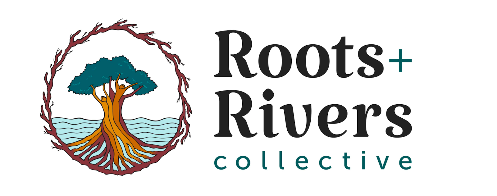
Participants also noted that the palette evoked mixed emotions: while earth tones like Midnight Green and Tea Green felt natural, calming, and grounded, Terracotta and Rich Black were polarizing and described as either vibrant or harsh, and sometimes feeling out of place. In response, we refined the wordmark to introduce more movement, visualization, and character, and adjusted the palette by simplifying the range of tones displayed and focusing on conveying warmth, vitality, and the welcoming nature of Roots + Rivers.
Original:

Updated:

If the Brand Perception Study asked, “Does this feel like us?”, the Usability Study asked, “Can people navigate our site and find the information they need efficiently?”
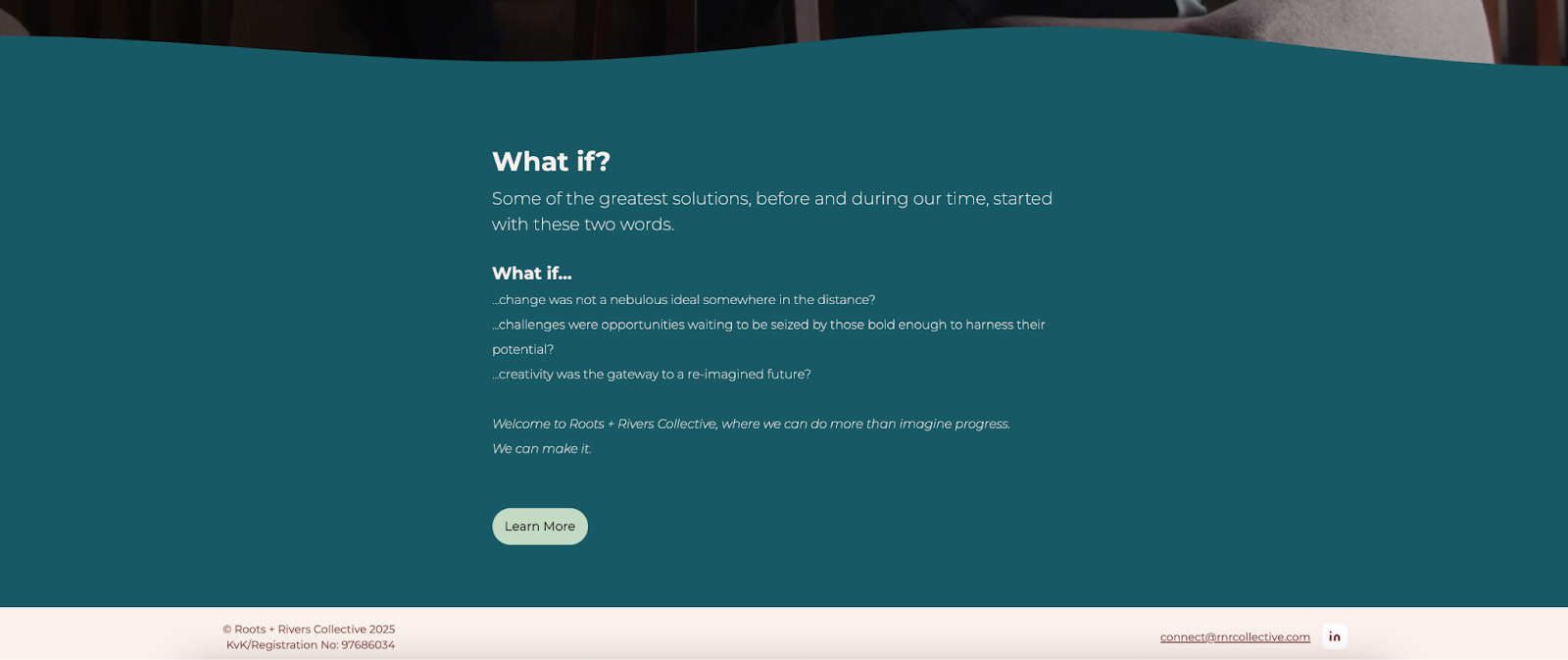
To make the Roots + Rivers website more intuitive and easier to understand, we invited six participants to complete five core navigation scenarios while engaging in a speak-aloud exercise. Across participants, the most significant issue was that the homepage did not immediately communicate what Roots + Rivers does or the impact that it has. Given that users often spend only a few seconds deciding whether to stay on a site, this lack of clarity posed a real risk.
Original:
Updated:
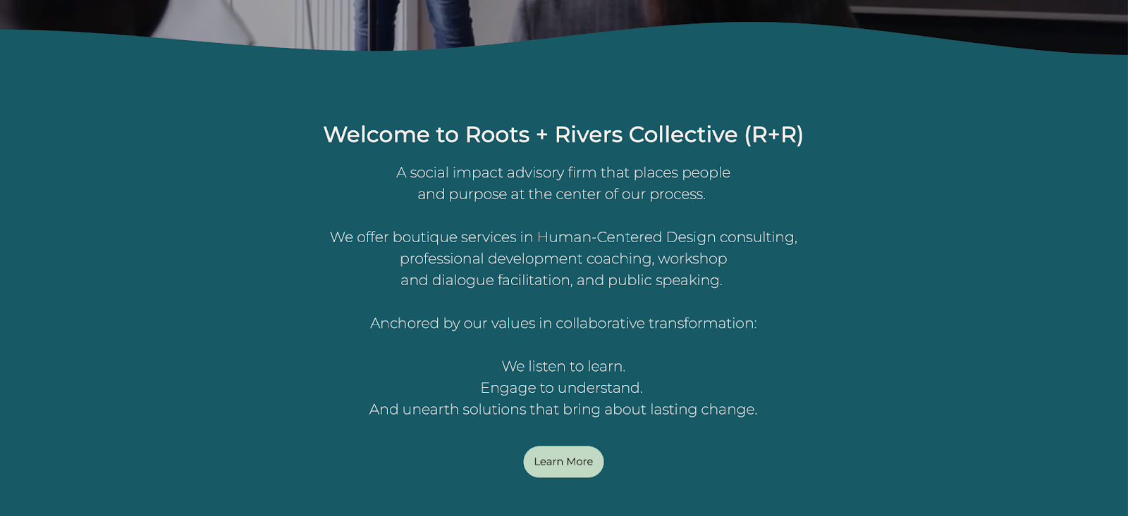
Participants also consistently struggled with dense blocks of text across core pages such as About, Services, and Team. Since the cognitive load was high, it led to mental fatigue and difficulty extracting key information. In response, we refocused the site around a quicker delivery of information, clarity, and text hierarchy.
These studies didn’t just result in tweaks; they reshaped how we understand our audience, how we think about our brand, and how we want to present ourselves. Roots + Rivers continues to evolve, guided by the same belief we bring to our partners: the best work emerges when people are centered, feedback is honored, and iteration is embodied as a form of care.
While writing a vision and mission statement is, indeed, a challenging intellectual exercise, living it requires a different set of mental muscles and practical discipline. A commitment to our values and beliefs is a perpetual practice in humility, experimentation, and applied learning. Our Brand Perception and Website Usability studies demonstrate that we understand both the intrinsic and external value of putting our principles to the test. When we center users, we replace well-intentioned assumptions with outcomes that create better experiences for the people we serve. As we continue to be a resource for positive change, we embrace Roots + Rivers Collective not merely as our name but as our mantra:
Grounded in the human experience.
Flowing with endless possibilities.